pacman::p_load(seriation, dendextend, heatmaply, tidyverse)
wh <- read_csv("data/WHData-2018.csv") In-class Ex5c: Heat Maps
Heat Maps
Installing and launching R packages, and loading data
Static Heatmaps
Preparing the data using by changing the rows by country name instead of row number
row.names(wh) <- wh$CountryTransforming the data frame into a matrix to be able to create heat maps
wh1 <- dplyr::select(wh, c(3, 7:12))
wh_matrix <- data.matrix(wh)
Plot default cluster heatmap using heatmap() of base R Stats package
wh_heatmap <- heatmap(wh_matrix)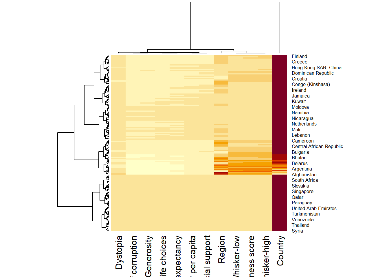
Use the arguments Rowv=NA and Colv=NA to switch off the option of plotting the row and column dendrograms.
wh_heatmap <- heatmap(wh_matrix,
                      Rowv=NA, Colv=NA)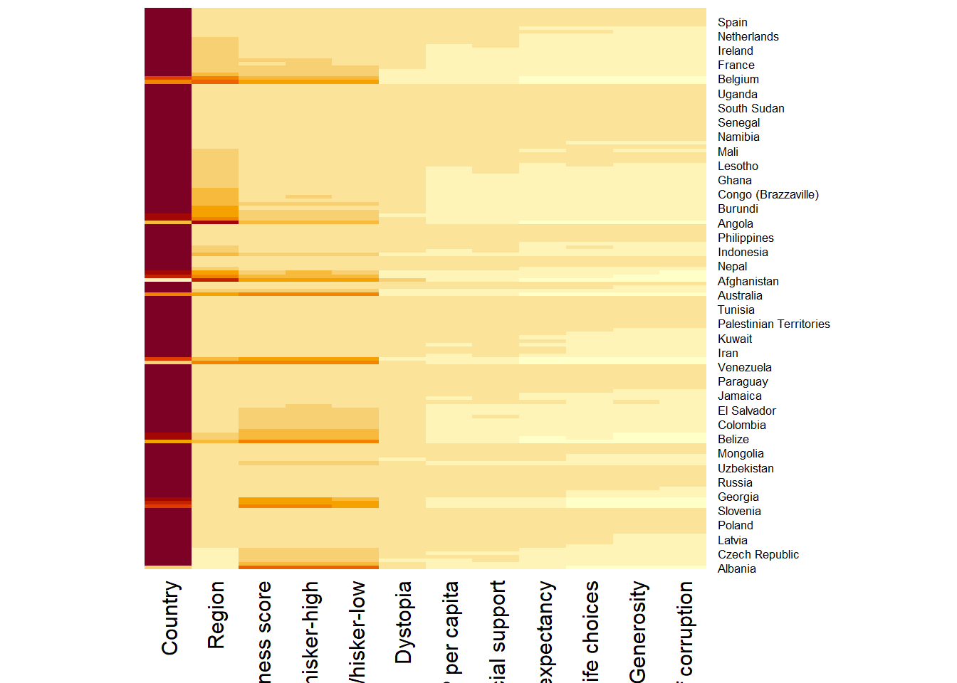
To normalize the matrix using scale argument for a more informative visual. Also note that margins argument is used to ensure that the entire x-axis labels are displayed completely and, cexRow and cexCol arguments are used to define the font size used for y-axis and x-axis labels respectively.
wh_heatmap <- heatmap(wh_matrix,
                      scale="column",
                      cexRow = 0.6,
                      cexCol = 0.8,
                      margins = c(10, 4))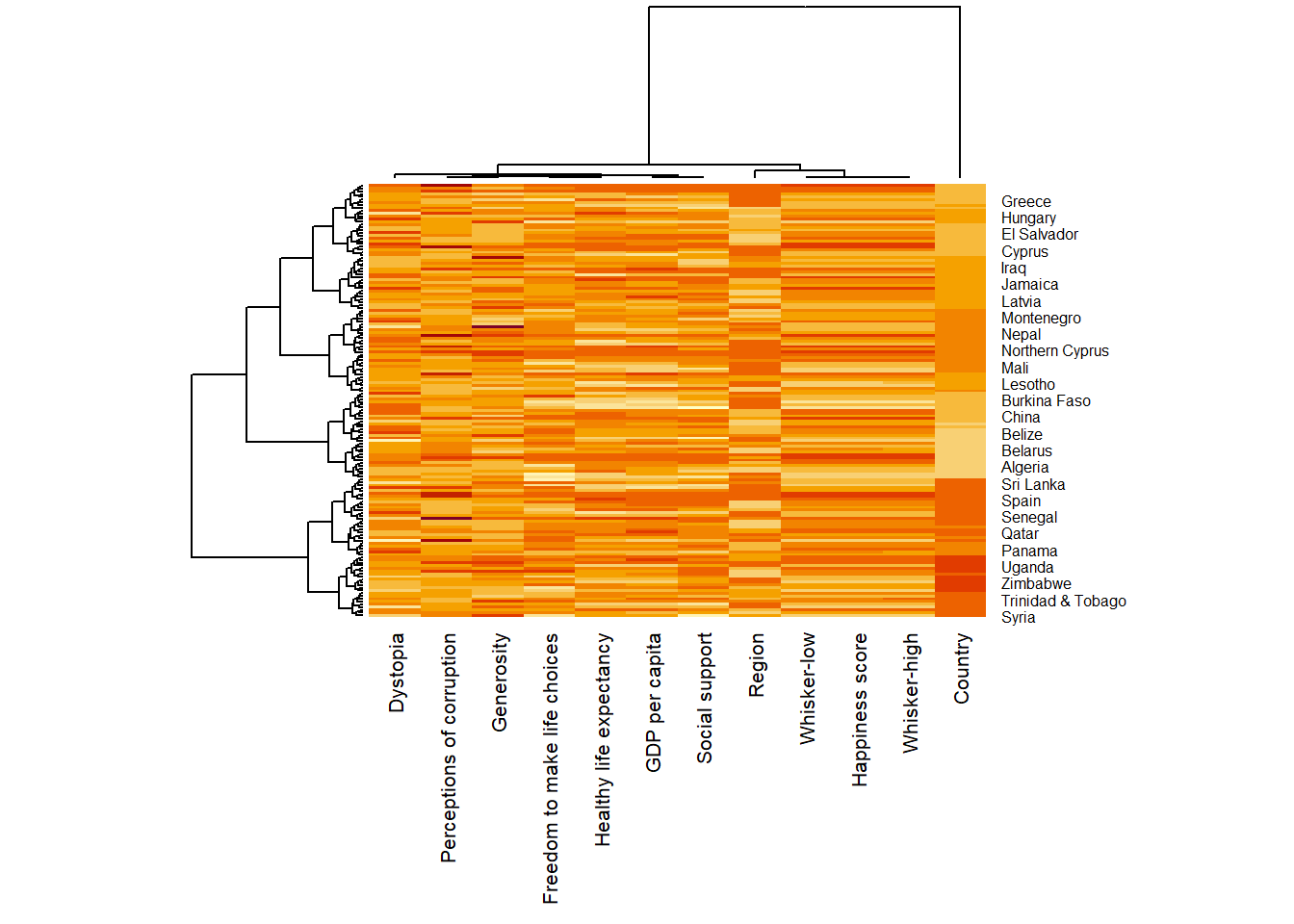
Interactive Heatmaps
Using heatmaply package
heatmaply(wh_matrix[, -c(1, 2, 4, 5)])Scaling method when assume to be normal distribution
heatmaply(wh_matrix[, -c(1, 2, 4, 5)],
          scale = "column")
Normalization method when assume to be different or non-normal distributions so that it is easily comparable on the same scale
heatmaply(normalize(wh_matrix[, -c(1, 2, 4, 5)]))Percentizing method
heatmaply(percentize(wh_matrix[, -c(1, 2, 4, 5)]))OLO - optimal leaf ordering, GW - Gruvaeus and Wainer
heatmaply(normalize(wh_matrix[, -c(1, 2, 4, 5)]),
seriate = "OLO")heatmaply(normalize(wh_matrix[, -c(1, 2, 4, 5)]),
seriate = "GW")Other plotting features to ensure cartographic quality heatmap can be produced
colors is used to change the colour palette
k_row is used to produce 5 groups.
margins is used to change the top margin to 60 and row margin to 200.
fontsizw_row and fontsize_col are used to change the font size for row and column labels
main is used to write the main title of the plot.
xlab and ylab are used to write the x-axis and y-axis labels respectively.
heatmaply(normalize(wh_matrix[, -c(1, 2, 4, 5)]),
          Colv=NA,
          seriate = "none",
          colors = Blues,
          k_row = 5,
          margins = c(NA,200,60,NA),
          fontsize_row = 4,
          fontsize_col = 5,
          main="World Happiness Score and Variables by Country, 2018 \nDataTransformation using Normalise Method",
          xlab = "World Happiness Indicators",
          ylab = "World Countries"
          )